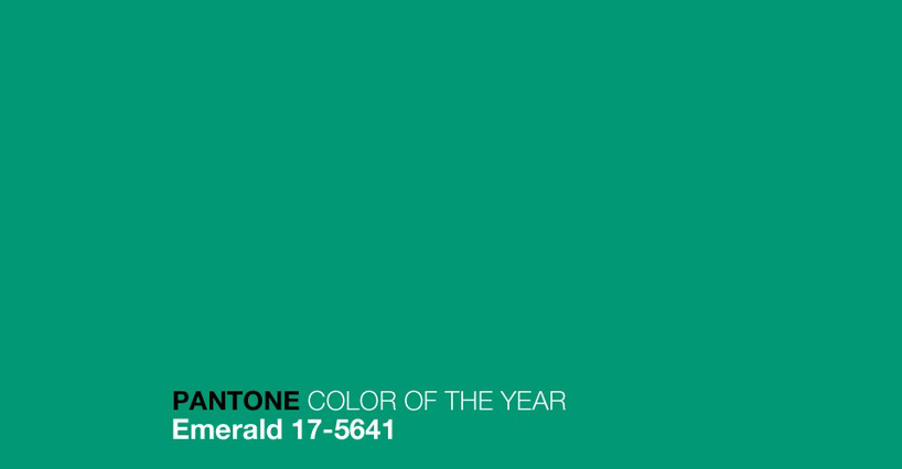
first image
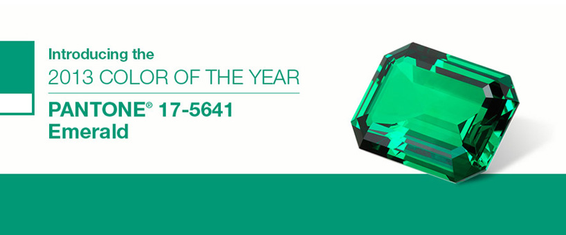
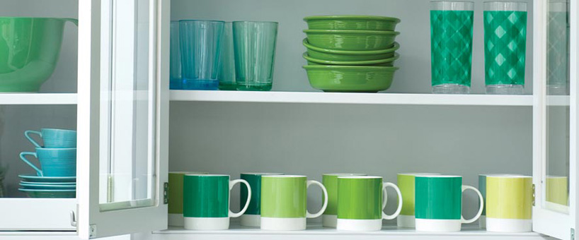
'emerald 17-5641' pantone 2013 color of the year
the color company pantone has selected 'emerald' as the color of the year for 2013.
it has been described as 'lively. radiant. lush...a color of elegance and beauty that enhances our sense of well-being, balance and harmony.'
leatrice eiseman, executive director of the pantone color institute® says:
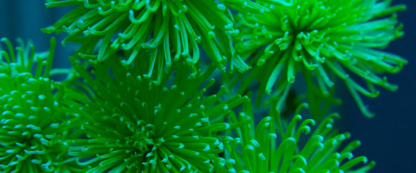
'the most abundant hue in nature, the human eye sees more green than any other color in the spectrum...as it has throughout history,
multifaceted emerald continues to sparkle and fascinate. symbolically, emerald brings a sense of clarity, renewal and rejuvenation,
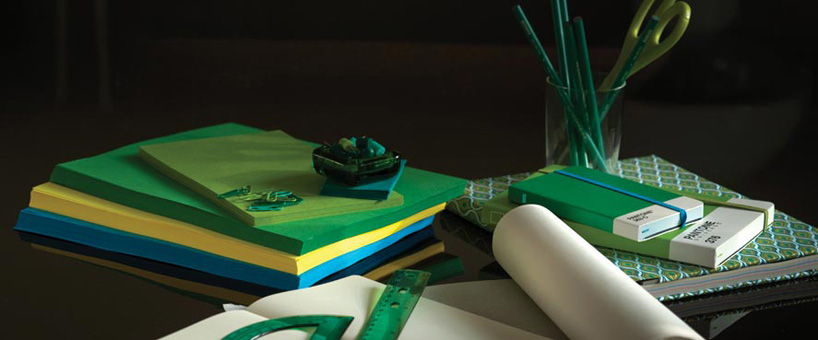
which is so important in today's complex world. this powerful and universally-appealing tone translates easily to both fashion and home interiors.'

'눈으로 보기' 카테고리의 다른 글
| Sketching Tutorials to Keep You Filling up Your Moleskine (0) | 2017.05.04 |
|---|---|
| 강산무진도 김인문 (0) | 2017.02.16 |
| 이미경의 그림이야기 (0) | 2016.11.17 |
| 목계산장 뒷산 정상의 아침 (0) | 2009.04.28 |
| 피지 난디성당 아빠, 엄마, 딸1, 딸2, 아들1, 아들2, 아들3, 아들4. 끝 (0) | 2009.02.14 |

